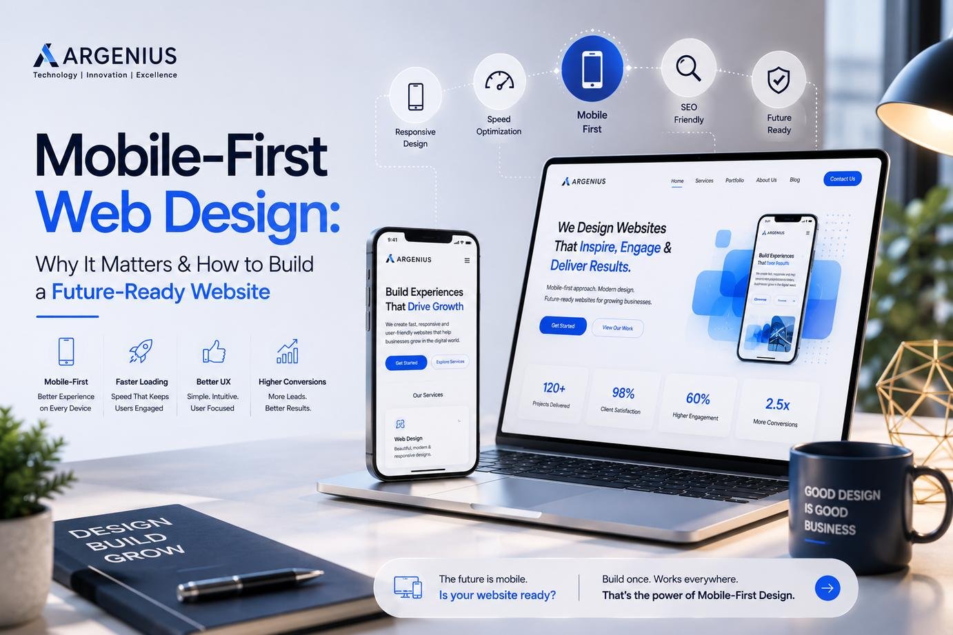
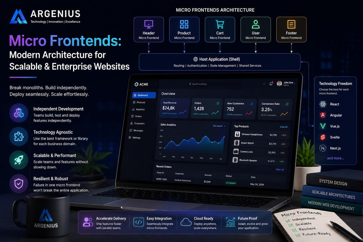
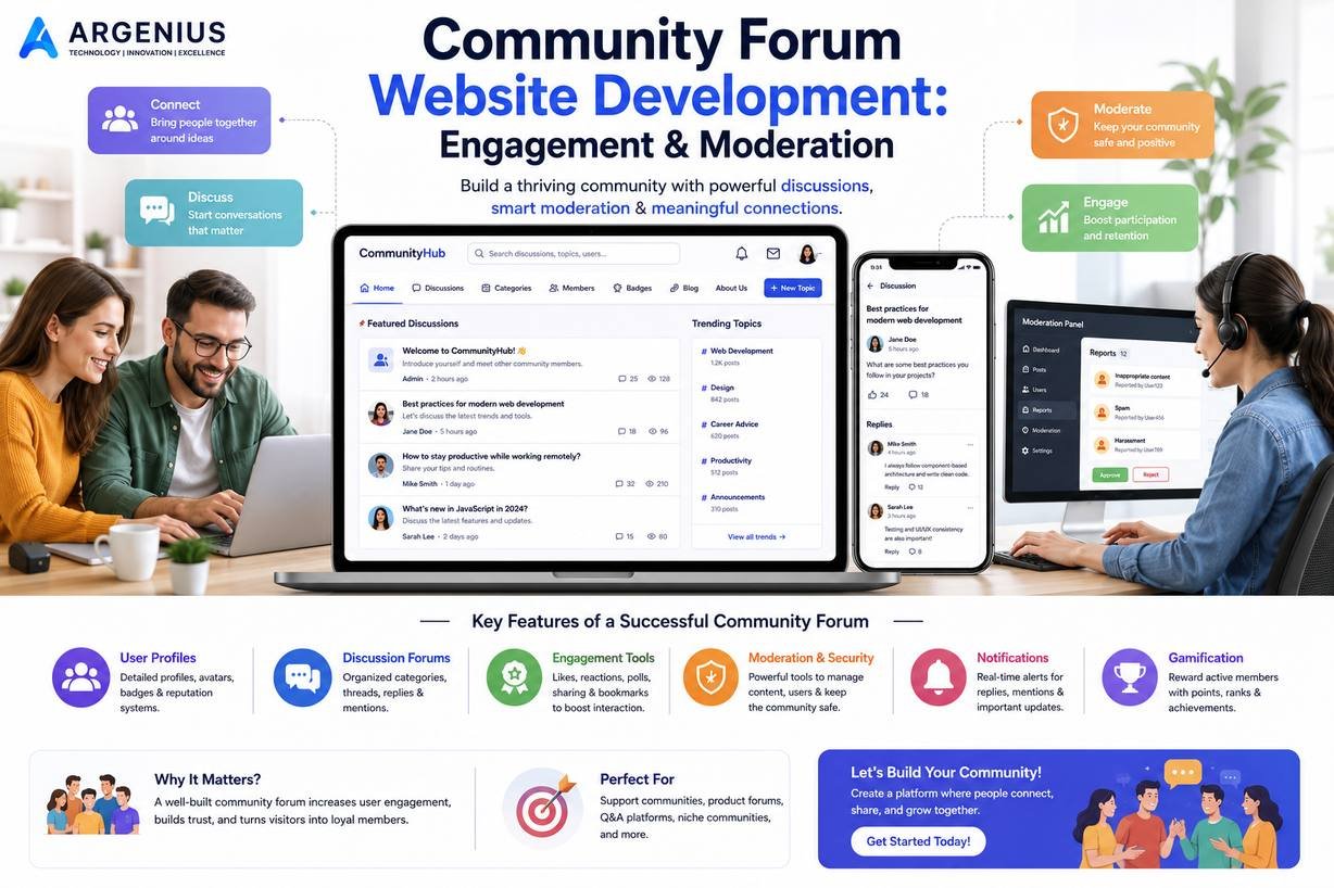
Discover why Mobile-First Web Design has become the standard for modern websites. Learn practical strategies to create responsive, fast-loading, and SEO-friendly websites that provide an exceptional experience across every device.
Why Mobile-First Design Has Become the New Standard
The way people browse the internet has changed dramatically over the past few years. Today, most users visit websites using smartphones instead of desktop computers. Whether someone is searching for a local service, shopping online, reading a blog, or comparing businesses, there's a good chance they're doing it from a mobile device.
This shift in user behavior has changed the way websites should be designed. Instead of creating a desktop version first and adapting it for smaller screens later, modern businesses now follow a Mobile-First Web Design approach. This method starts with designing for smartphones and gradually expands the experience for tablets, laptops, and desktops.
At Argenius, we've found that businesses adopting a mobile-first strategy often achieve better engagement, improved search visibility, and higher conversion rates. A website that works seamlessly on mobile devices not only satisfies visitors but also supports long-term business growth.
What Is Mobile-First Web Design?
Mobile-First Web Design is a design philosophy where the mobile version of a website becomes the starting point of the development process. Instead of removing elements from a desktop layout to fit smaller screens, designers focus first on the most essential content and functionality for mobile users.
Once the mobile experience is optimized, additional enhancements are introduced for larger screens without compromising usability.
This approach naturally encourages simplicity, better navigation, and faster loading pages.
Why Mobile-First Design Matters
Modern users expect websites to load quickly and function smoothly regardless of the device they're using. A website that requires excessive zooming, slow loading, or difficult navigation creates frustration and often causes visitors to leave.
Search engines also prioritize mobile-friendly websites because they want to provide users with the best possible browsing experience. A mobile-first approach supports these expectations by creating websites that are easier to use, faster to load, and more accessible across different devices.
Businesses that embrace this strategy often experience improved customer satisfaction, stronger engagement, and better online visibility.
Better User Experience Across Every Device
User experience sits at the center of mobile-first design. By focusing on smaller screens first, designers naturally eliminate unnecessary elements and prioritize content that truly matters.
Visitors should be able to:
- Read content comfortably
- Navigate menus easily
- Tap buttons without difficulty
- Complete forms quickly
- Access important information within seconds
A smooth experience encourages visitors to spend more time exploring your website and increases the likelihood of conversions.
Mobile-First Design Supports Better SEO
Search engines evaluate websites based on factors such as mobile usability, page speed, content accessibility, and user experience. A mobile-first website naturally aligns with these expectations.
Some SEO advantages include:
- Faster page loading
- Better Core Web Vitals
- Improved mobile usability
- Lower bounce rates
- Better crawlability
- Enhanced user engagement
These improvements contribute to stronger organic search performance over time.
Focus on Content Before Decoration
One of the biggest strengths of mobile-first design is its emphasis on content.
Limited screen space forces businesses to prioritize clear messaging, valuable information, and meaningful calls-to-action instead of relying on unnecessary visual elements.
Visitors appreciate websites that communicate quickly without overwhelming them with clutter.
Simplify Navigation
Navigation should feel effortless regardless of screen size.
Good mobile navigation includes:
- Clear menus
- Logical page hierarchy
- Visible contact options
- Sticky navigation where appropriate
- Easy-to-tap buttons
Simple navigation helps users find information faster while improving overall usability.
Optimize Images and Media
Large images remain one of the most common causes of slow mobile websites.
To improve performance:
- Compress images
- Use WebP format
- Resize images appropriately
- Enable lazy loading
- Avoid unnecessary background videos
Optimized media improves loading speed while preserving visual quality.
Design for Touch, Not Mouse
Unlike desktop users, mobile visitors interact using their fingers.
Buttons should be large enough to tap comfortably, links should have sufficient spacing, and interactive elements should respond smoothly to touch gestures.
Small usability improvements can significantly enhance the overall experience.
Prioritize Website Speed
Performance is one of the biggest factors affecting mobile usability.
Businesses should focus on:
- Fast hosting
- Optimized code
- Browser caching
- Reduced JavaScript
- Lightweight CSS
- CDN integration
A faster website improves both user satisfaction and search engine performance.
Test on Real Devices
Responsive layouts should always be tested on actual smartphones and tablets instead of relying solely on browser simulations.
Testing helps identify issues such as:
- Button spacing
- Font readability
- Image scaling
- Form usability
- Navigation problems
Real-world testing leads to better experiences for actual users.
Common Mobile Design Mistakes
Avoid these common mistakes:
- Tiny buttons
- Small fonts
- Slow loading pages
- Horizontal scrolling
- Pop-ups covering content
- Complex navigation
- Poor color contrast
- Unoptimized images
Correcting these issues creates a much smoother browsing experience.
Why Businesses Trust Argenius
At Argenius, every website is designed with mobile users in mind from the very beginning. Our development approach combines responsive layouts, modern UI/UX principles, technical SEO, Core Web Vitals optimization, and fast-loading architecture to create websites that perform consistently across all screen sizes.
Rather than simply making websites "fit" on mobile devices, we design complete digital experiences that help businesses engage visitors, build trust, and increase conversions.
Final Thoughts
Mobile-first design is no longer a trend—it's the foundation of modern web development. As mobile usage continues to grow, businesses that prioritize responsive, user-friendly, and high-performing websites will be better positioned to attract visitors and remain competitive.
By focusing on simplicity, speed, accessibility, and usability, you create a website that serves users effectively while supporting long-term SEO and business growth.
If you're planning to build a new website or redesign an existing one, Argenius can help you create a mobile-first website that delivers exceptional performance, modern design, and measurable business results.
Frequently Asked Questions
What is Mobile-First Web Design?
It is a web design approach where designers create the mobile version of a website first and then enhance it for larger devices like tablets and desktops.
Why is Mobile-First Design important?
It improves user experience, supports better SEO, increases website performance, and ensures your website works effectively across all screen sizes.
Does Mobile-First Design improve Google rankings?
While no single factor guarantees rankings, a mobile-friendly website with good performance and usability supports Google's ranking systems and contributes to better SEO.
What's the difference between Responsive Design and Mobile-First Design?
Responsive design ensures a website adapts to different screen sizes, while mobile-first design starts the design process with mobile devices before expanding to larger screens.
Can Argenius build a Mobile-First website for my business?
Yes. At Argenius, we design and develop responsive, SEO-friendly, and performance-optimized websites that deliver a seamless experience across smartphones, tablets, laptops, and desktops.