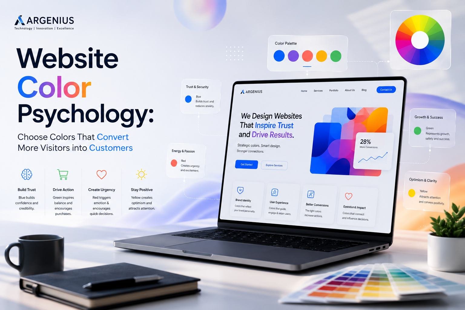
Choosing the right website colors is more than a design decision. Learn how color psychology influences user behavior, builds trust, and helps increase conversions with practical insights from Argenius.
Why Website Colors Matter More Than You Think
When people visit a website, they don't consciously analyze every design element. Instead, their brain forms an impression within seconds based on colors, layout, typography, and visual consistency. Before reading your services or exploring your products, visitors have already started developing an opinion about your brand.
This is where website color psychology becomes important. The colors you choose influence how visitors feel, how much they trust your business, and whether they continue browsing or leave your website. While colors alone won't guarantee conversions, they play a significant role in creating the right emotional response and guiding users toward important actions.
At Argenius, we've worked with businesses from different industries and have seen how thoughtful color selection can improve user experience, strengthen branding, and support higher engagement. The best color palette is not always the brightest or the trendiest—it's the one that aligns with your brand, audience, and business goals.
What Is Website Color Psychology?
Website color psychology is the practice of using colors strategically to influence user perception and behavior. Every color creates different emotional associations, and those associations affect how visitors interact with your website.
For example, some colors communicate trust and professionalism, while others create excitement, urgency, or creativity. The goal is not to manipulate users but to create a visual experience that matches your brand identity and helps visitors feel comfortable taking the next step.
A well-planned color strategy supports navigation, improves readability, highlights important information, and strengthens brand recognition.
How Colors Influence User Decisions
People often make purchasing decisions based on emotions before they justify them with logic. Website colors contribute to those emotional responses by creating a certain atmosphere.
A professional financial company typically uses different colors than a children's education platform because each business wants to communicate different values.
The right colors can help visitors:
- Feel confident about your brand
- Notice important call-to-action buttons
- Read content more comfortably
- Understand your visual hierarchy
- Remember your brand more easily
Good design isn't about using more colors—it's about using the right colors consistently.
Understanding Common Color Meanings
Although color perception varies across cultures and industries, some general associations are widely recognized.
Blue – Trust and Professionalism
Blue is one of the most commonly used business colors because it creates a sense of reliability, confidence, and stability.
It's often chosen by:
- IT companies
- Financial businesses
- Healthcare providers
- Software companies
- Corporate brands
This is one reason why many successful technology companies incorporate blue into their branding.
Green – Growth and Balance
Green is strongly associated with nature, growth, sustainability, and wellness.
Businesses commonly using green include:
- Healthcare
- Organic products
- Finance
- Environmental organizations
- Wellness brands
Green also creates a calming experience that many users find comfortable.
Red – Energy and Urgency
Red naturally attracts attention.
It works well for:
- Limited-time offers
- Sale banners
- Important notifications
- Promotional campaigns
However, excessive use of red may overwhelm visitors, so it should be used carefully.
Orange – Action and Enthusiasm
Orange combines the energy of red with the friendliness of yellow.
It is frequently used for:
- CTA buttons
- Start Free Trial
- Subscribe
- Sign Up
Because it stands out without appearing aggressive, orange often performs well for conversion-focused elements.
Yellow – Optimism and Creativity
Yellow creates a feeling of positivity and warmth.
It can be effective for:
- Creative businesses
- Educational platforms
- Lifestyle brands
Since bright yellow may reduce readability, it is usually best used as an accent rather than a dominant background color.
Black – Luxury and Sophistication
Black represents elegance, exclusivity, and premium quality.
Luxury brands often use black with minimal layouts to create a modern, sophisticated appearance.
White – Simplicity and Clarity
White space is just as important as color itself.
A clean white background:
- Improves readability
- Reduces distractions
- Makes content easier to scan
- Creates a modern appearance
Minimalist websites rely heavily on white space to improve user experience.
Build a Consistent Color Palette
One common mistake businesses make is using too many unrelated colors throughout their website.
A professional website usually follows a simple palette consisting of:
- Primary brand color
- Secondary supporting color
- Neutral background colors
- Accent color for buttons and highlights
Consistency helps users recognize your brand while making the interface feel organized and trustworthy.
At Argenius, we typically recommend creating a design system before starting development so that colors remain consistent across every page.
Make Call-to-Action Buttons Stand Out
One of the most practical uses of color psychology is guiding users toward important actions.
CTA buttons should be:
- Clearly visible
- Different from surrounding colors
- Easy to identify
- Consistent throughout the website
Visitors should never have to search for your "Contact Us," "Get a Quote," or "Book a Consultation" button.
The goal is not to make buttons flashy but to make them obvious.
Consider Accessibility When Choosing Colors
Beautiful colors mean very little if visitors struggle to read your content.
Accessibility should always be part of your color decisions.
Best practices include:
- High contrast between text and backgrounds
- Readable button labels
- Clear hover states
- Color combinations suitable for color-blind users
- Consistent visual hierarchy
Accessible websites provide better experiences for everyone.
Don't Follow Trends Without a Strategy
Design trends change every year, but your brand identity should remain recognizable.
Instead of changing colors simply because they are popular, choose a palette that reflects your business values and speaks to your target audience.
Consistency builds stronger long-term brand recognition than constantly chasing new trends.
Test and Improve Over Time
Even carefully planned color choices can be improved through testing.
Businesses should monitor how visitors interact with:
- CTA buttons
- Contact forms
- Navigation menus
- Promotional banners
- Landing pages
Small adjustments to contrast, button colors, or visual emphasis can improve user engagement over time.
Common Website Color Mistakes
Avoid these mistakes when designing your website:
- Using too many bright colors
- Poor text contrast
- Inconsistent branding
- Low visibility CTA buttons
- Overusing red or yellow
- Ignoring accessibility
- Copying competitors without strategy
A thoughtful color system creates a more professional and trustworthy experience.
Why Businesses Choose Argenius for Website Design
At Argenius, we believe color selection is a strategic business decision rather than just a visual preference. Every website we design begins with understanding the client's industry, audience, and branding goals before creating a color system that supports usability, trust, and conversions.
Our design process combines color psychology, UI/UX principles, responsive development, and SEO best practices to create websites that not only look professional but also encourage meaningful user interactions. Whether you're launching a new business website or refreshing an existing one, we focus on building a consistent visual identity that supports long-term growth.
Final Thoughts
Website color psychology is about much more than choosing attractive colors. The right palette helps communicate your brand personality, improves readability, guides user attention, and creates an environment where visitors feel confident taking action.
Rather than selecting colors based solely on personal preference or current trends, businesses should choose combinations that reflect their values and support their goals. A consistent, accessible, and strategically planned color system can strengthen both user experience and conversion performance.
At Argenius, we help businesses create visually appealing, conversion-focused websites where every design decision—including color—supports better user experiences and measurable business outcomes.
Frequently Asked Questions
Why is color psychology important in website design?
Color psychology helps shape how visitors perceive your brand, influences user behavior, and supports better engagement by creating a visually comfortable and trustworthy experience.
Which color is best for business websites?
There is no single best color. The right choice depends on your industry, audience, and brand identity. Professional businesses often use blue, while wellness brands may prefer green.
Do website colors affect conversions?
Yes. Strategic use of color can draw attention to important elements like call-to-action buttons, improve readability, and encourage users to complete desired actions.
How many colors should a website use?
Most professional websites work well with one primary brand color, one secondary color, neutral backgrounds, and one accent color for highlights and buttons.
Can Argenius help choose the right color palette for my website?
Yes. At Argenius, we create customized color systems based on your industry, target audience, branding, and business goals to ensure your website is both visually appealing and conversion-focused.